Ideation to Launch, designing a SaaS product
Building a SaaS product with permission levels
The Project
Role | Responsibility
UI design, UX design, prototyping, design system, cross-functional collaboration with engineering and product
Tools
Figma, FigJam, Google Sheets, Google Meet, Ionicon, Google Docs, Slack, Jira
Scope
UX | UI designer, human-centered design
About Haled and myMedSpa
Haled is a full-service SaaS solution bridging the gaps in health case management through our 360-degree business portal and mobile network of certified healthcare professionals. During my time with Haled, they transitioned to myMedSpa, still connecting clients to in home provided services, but now with med spa companies and providers.
The Problem
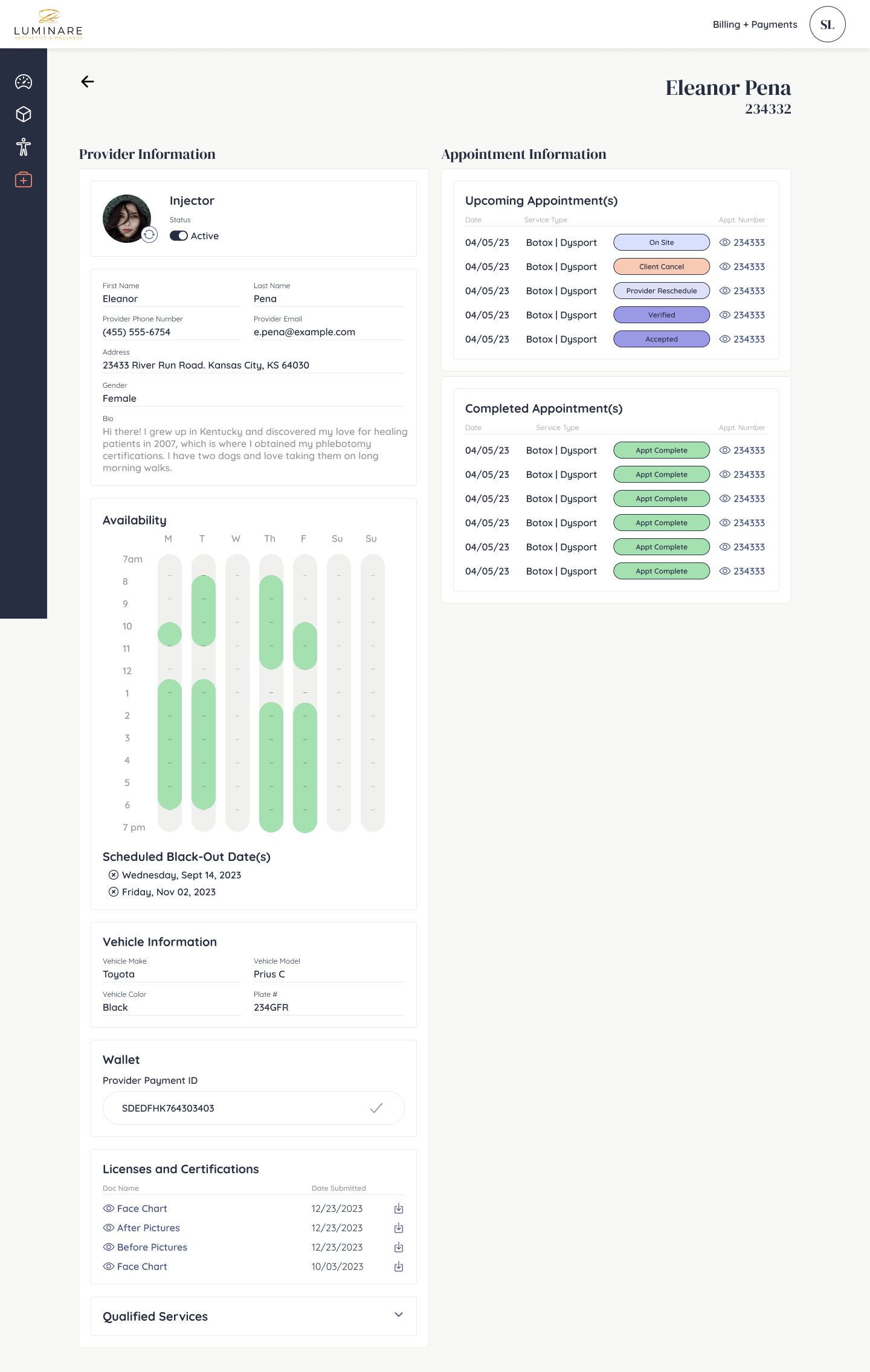
As Haled continued to collect client companies, it became clear that they were struggling with managing their own clients and employees under one roof- juggling a variety of applications and softwares, many of which were out-of-date and equipped for the job. At Haled, we decided to expand our collection of services to expand past the previously created Client and Provider apps, to help the companies directly with a SaaS product, in which Haled can manage and oversee.
How Can We Measure Success?
SaaS needs to be oversee app activity with ability to intervene as necessary.
Hierarchy and structure needs to support the bottom up user flow.
Product feels intuitive and human-centered, as the product is now closer connected with the provider and client users.
Synthesizing needs from product, sales and marketing teams in addition to identifying how the SaaS product needs to interact with the two existing apps.
Discover + Define
First step is first, after receiving a long list of requirements from product, sales + marketing, I organized the collective thoughts on FigJam in an way that I can visually dissect the information and begin determining the hierarchy of need.
Here we can see I am identifying how the SaaS product will need to interact with Haled’s two existing apps, and what overarching features does the SaaS product need.
Lo-Fi Designs + Cross-Functional Collaboration
Adding in more perspectives early + often
For me, the most valuable aspect of designing is bringing in product and engineering into the conversation early and often. As soon as the lo-fidelity stage when I have loose sketches done, I like to bring in my collaborators to have a conversation to help me consider the problem from all angles. At this stage, I can be an advocate for my design and the user experience, but also invite voices in to verify that the design will allow ease for Haled in their marketing, sales and management in addition to validating that my designs can be executed within an appropriate timeline to keep the project on track.
Above are loose lo-fi sketches that I shared with my team. You can see sticky notes left by teammates in addition to notes I made in meeting based off our conversation. I find that if I share designs at this stage, my teammates are more eager to add their thoughts, share innovative ideas and problem solve as the wireframes have not yet been constructed.
Hi-Fi Wireframes
Want to work with me and need a referral?
“I worked with Leah at Haled, and I cannot recommend her highly enough! Her designs were always on point and she was able to solve problems with UX that confounded me as an engineer. Additionally, the speed with which she was able to work always impressed me.
Perhaps more importantly is how great of a teammate she was. She took pride in her designs, but not to the point of ego. If things needed to change, she understood where to walk the line in what could change and what was essential for the user experience. She was always professional and communicative and enjoyed working with the engineering team who was implementing her designs.”


