Brand, Design System + Custom Visuals
Formulating a consistent company presence for a MVP
The Project
Role | Responsibility
Founding product designer entrusted with the development and design for NextBike’s MVP.
Tools
Figma, FigJam, Google Sheets/Excel, Google Meet, Google Icons, Google Docs, Monday, Adobe Illustrator, Open-Source photography, Chat GPT
Scope
User journey + flows, site map, product research, brand guide, design system, lo-mid-high-fidelity wireframes, custom icons, custom imagery, prototyping, project management.
About NexBikes + The MVP
NexBikes is a Boulder, CO + Wales based company launching their first MVP, a webapp aimed to help cyclists identify compatible parts for their bicycles in addition to record keeping for rider measurements and bike modifications and upgrades. NexBikes is very eager to further use AI-integration to recommend bike modifications based off user specifications in further development.
From NexBikes:
“We brought Leah onboard to help us develop our MVP. We understood the markets and could clearly articulate the vision and user needs but struggled with how to turn that into a tangible, professional, and intuitive product. Leah came onboard and got us organized and on schedule. She quickly learned the intricacies of the solution and industry and asked us the right questions to coax out the appropriate design. She readily gave her advice, perspective, and recommendations through the process.
Leah is well-versed and well trained in user experience and data driven design, but her background as an artist truly shines through a product design process. She has an eye for color, design placement, and user flow that is superior to many product designers I have worked with in previous roles. Not only was she able to help us simplify a relatively complex concept to a simple, intuitive and beautiful flow, she was also able to support us with custom imagery and custom icons to provide a unique flair to the site.
On top of that, she is an incredibly adept and professional project manager. She helped us stay on task, was communicative with her hours and where we were at in the design process, and gently kept us on track and within MVP scope.”
The Pain-Points + The NEX Solution
The lifecycle of invested bicycle ownership is more complicated than it needs to be.
The experience of bicycle maintenance, upgrades and tracking is much more complicated and frustrating than it needs to be. With many unique parts to be replaced, large range in price-points per those parts, and difficulty to identify if a part is compatible with each user’s bike, bike owners are turning to mechanics to help them solve their problems- and even then, mechanics are struggling to efficiently identify compatible parts.
NexBikes is solving this problem through AI-supported bike recommendations, a robust parts-compatibility database and simple purchasing options while also providing an invaluable place to manage modification + upgrade records in addition to rider specifications.
User Journeys + NEX Focus
With a defined problem + need, we first how we can solve the user’s needs right out of the gate. We as a team brainstormed our primary user’s journey as they are confronted with different points in trying to solve their pain-points. We asked questions like
“What questions would our persona be asking in order to solve their problem?”
“Who would they turn to and trust for answers?”
“What sort of first-impression are we hoping for?”
“What would define a successful interaction with our webapp?”
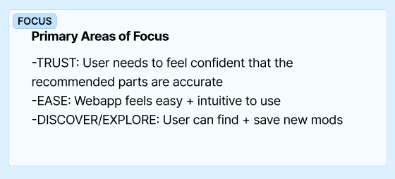
Based off of our user journey research and collaboration, we knew that NexBike’s highest UX priorities were to build trust, be simple and intuitive to navigate, and have a robust database with enough products that the user feel confident in their search results. We used these focuses as our north stars as we continued to refine the product.
Refining the MVP
(While ensuring future-features have an intuitive place to land)
When NexBikes approached me for this product, they had a plethora of features that they knew they wanted. First steps were refining which features were primary and crucial for the webapp to function as an MVP, and what features could be pushed out to after launch. Since we knew the product would grow in the not-too-distant future, it was important for me that we develop the webapp with growth in mind. Below, see the MVP pages and features in blue, which future-features defined in grey.
Development Through Wireframes
I typically like to design through all of the wireframes, from low-fidelity frames all the way through high-fidelity to allow my collaborators plenty of opportunities to re-define, iterate, expand and eliminate aspects. The more eyes at each stage of the process allows for the most thought-through designs.
Low-fidelity wireframes considering the user profile. Already we are seeing a need for custom visuals and interactions with popup screens and a need for editability.
Mid-Fidelity wireframes cleaning up and iterating upon feedback on lo-fi wireframes.
High-Fidelity wireframes including design system components, cards and custom visuals.
Brand Guide + Consistency
Using color, shape and hierarchy to build brand consistency (aka trust for users)
While I was developing and thinking through the user flows, journeys and site-maps, I referred NexBikes’ to one of my favorite logo designers. I knew that timeline was important for Nex, and delegating off tasks to my trusted peers was a great way to show I know how to move a project along and use our time efficiently and effectively.
Color Palette + Usage| After landing on a black and white logo from my referral designer, I offered Nex a variety of color palettes to choose from that supported the function of the product, built trust and, importantly, was accessible and allowed options for the eventual mobile dark-mode. Offering pre-approved options allows my clients to confidently choose based on their preference, knowing that I have taken care of the vital user-experienced aspects. Once our palette was selected, I clearly defined in my design system documentation exactly which colors can be used in combination with copy for high-accessibility scores.
Typography | Inspired by the Adobe font of the logo, I opted for the Google Font Cairo for headings, and the highly-accessible Lato for the primary copy font.
Line-Weight | Nex made it clear from the beginning that they wanted a “cool” looking UI. I stepped outside of the expected by following the design of the logo with a variety of line weights on my cards and footer, giving the webapp a fresh and unique look.
“About” page showcasing unique card line-weights and color gradients.
The Design System
Components, variants, prototype interactions + cards
I developed NexBikes’ design system to ensure consistency across the wireframes, but also for ease in development. The more information I can provide to my developers the more I can ensure that the product will be built per my specifications. My variants allow developers to view my my wireframes with ease and simply identify changes in design in a variety of instances. Where possible, I also place interactions into the design system, creating a more polished and sophisticated prototype.
Cards created with components and variants makes for easy updating, iterating, and consistency across the webapp.
Creating components + variants for a highly-interactive prototype
When applicable, adding interactions into the design system
Custom Visuals
Iterating down to a custom ChatBot icon developed in Figma
AI-Mechanic (In Figma)
An important feature of NexBikes was their ChatBot, the AI-Mechanic. We knew that we would need to develop something custom for this icon, unique to the webapp that would support the tone. Nex provided some ChatGPT generated icons to get the ball rolling, and from there in Figma, I iterated upon the initial concepts to connect the icon more to our branding. After several rounds of iterating and talking about it in Figma and Monday, we landing on a final, complete with an on-hover introduction speech bubble.
Custom Illustrations (In Adobe Illustrator)
An important user-centric experience in NexBikes was showing users where to find information about their bike on their bikes, in addition to showing them how to take accurate body measurements, which helps the users ensure proper bike fit. I developed custom imagery in Adobe Illustrator consistent with the design system documentation, displaying a variety of sharp and rounded corners, minimal color palette and tone.
Custom imagery developed in Adobe Illustrator


